 | | | | | | | | | | | | | | | | | | | | | |
|
| |
|
|
preface
I'm not a graphic designer, I don't even play one on television. But I am a consultant who advises many graphic designers on technical matters of software and hardware. I can not vouch for the quality of my workmanship here as I am a novice at this.
Further, this How To is really designed for beginners. One of the things that I love about Create is that it lowers the cost for entry into the world of page layout while still providing many of the features that beginners... like me, would need to make professional looking documents.
tools
I am using a pre-release build of Create 12.1 ( this dates this as the current version is 12.3 ). Considering the fact that it is working as well as it is, I can say that I am sure that the final public version should be on it's way soon.
Additionally, I am using TextEdit and TextExtras. Both TextEdit and TextExtras are free.
Also, the images are edited using ToyViewer and PixelNhance (click here for the Caffeine Software disk image, 58 MB) which are also both free applications. I'll do some How To s on them at a later time.
content
This How To is based on a presentation I gave to a Mac OS X Special Interests Group back in January of this year. I am using the first few pages of the Legend of Sleepy Hollow as the text of our example document. I'm using images from the film for the illustrations.
First things first...
We have images, we have a body text, what we need now is to decide on a few basics. For the typeface of the body I'm going to use Times New Roman. It is a serif typeface (a typeface with ledges on the edges as a posed to sans typefaces which are smooth... like Helvetica) which should go nicely with the age of our content. Additionally I'll be using Zapfino as our second typeface as it has a wonderful style to it and it demonstrates just how nice Apple's text services are with ligatures.
organizing the page
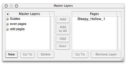
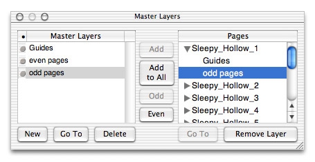
Though we could just slap all this stuff on a page, it is better to set up a guide for our work. This is done with master layers (File menu to Master Layers). In the image below I have created three master layers for our example document. |
|
| | | |
|
|
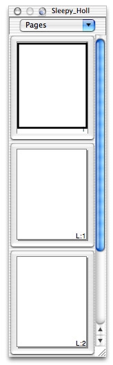
| These layer show up in the thumbnail window (Tools menu to Page Thumbnails). |
|
| | | | | | | | |
|
|
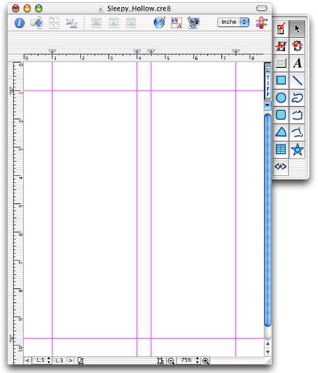
For this example we are going to have two columns of text on each page. Selecting the first master layer in the thumbnails window and then add guides. This is done by grabbing the ruler (make sure the ruler is showing) and moving up to get a guide arrow. On the side ruler it is done by grabbing the ruler and pulling to the left. Getting rid of guides is like pulling icons out of the dock... just pull the arrows from the rulers and they are gone.
I set my top and sides to 1" with a gutter of 0.5" between the columns. In the master layers window, click on the "add to all" button. Now when you click on the first page in the thumbnail window, you are presented with the master layer's guides. |
|
| | |
|
|
For the odd and even master layers, I'm going to add some text and page numbers. But I'm going to shift them to either side of the page depending on if they are odd or even pages.
The page number object is found in the Object menu under New Object. |
|
| | | |
|
|
working with content
Now we can get started with adding content. Select the first page in the thumbnails window. Assuming that you have the content some where else (I have mine in TextEdit), go to it and copy it. In create select the text tool and make an out line to fit the guides of the first column on the page.
The content I'm using is more than will fit in the first column. Selecting the pointer from the tools, the text area should now be an object on the page. It also should have a small red plus at the bottom. That is to let you link that text field to another text field. Clicking on the red plus loads the curser to let you make another text field.
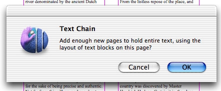
Once again, I have more content than will fit in the next column. So I once again load up the curser, but this time I go to the page pull down menu in the thumbnails window and select add page. Create asks if I want to add as many pages as needed to complete the text chain using the current layout. Clicking okay, Create builds the pages I need (11 additional pages). |
|
| | | |
|
|
| Now that I have all these pages, I can add the odd and even master layers to them. In the master layers window, click on the odd master layer and click on the odd button in the window. Do the same for the even master layer (and even button). |
|
| | |
|
|
As I don't want a page number on my first page, I can remove the odd master layer just from page one by clicking the arrow next to it in the master layers window and selecting the layer I want removed and then clicking remove layer.
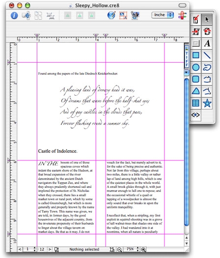
We can now start making some changes and additions. In the beginning of Sleepy Hollow there is a small amount of text as a letter. I'm going to add that to the first page. First I resize the text fields that I made earlier (moving them do to about mid-page).
This is more for an example than anything. As I said earlier, I'm not a graphic designer. |
|
| | | |
|
|
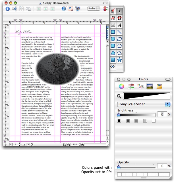
| On the next page I added an image of a scare crow. I dropped in the image, arranged it to the back and as I wanted to have the text wrap to the oval I made an oval the same size of the oval in the image. I then made the oval transparent by using Apple's Colors Panel (I did a write up on the Rhapsody version here and there is a nice write up on the Mac OS X version here ). |
|
|
|
|
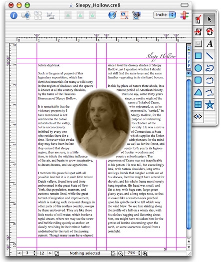
| I did the same thing again with an image of Christina Ricci... |
|
| | | | |
|
|
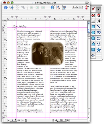
| On the fourth page I dropped in an image which was rectangular in nature to begin with, so I just wrapped the text around the image itself. |
|
| | | | |
|
|
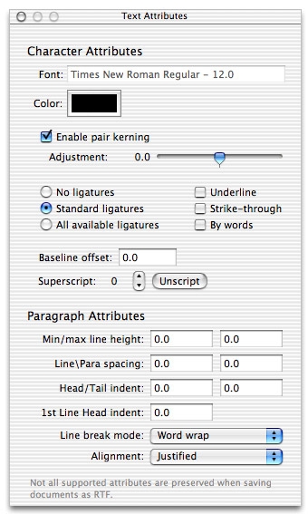
| Some people would want to have the body text justified. Using the tools supplied by Apple's text services in the Format menu under Text, adjustment to the kern of text elements and the like can be done to make the text look nicer (note that I didn't take a lot of time on this). |
|
| |
|
|
| Further, by using TextExtras (talked about in another page I did on TextEdit here), you can have a panel to help you make use of the things text services provides. |
|
| | | | | | |
|
|
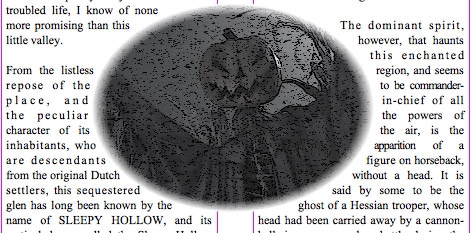
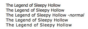
| This image gives you a better idea of what text looks like that has been kerned. |
|
| | | | | | | |
|
|
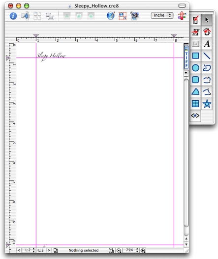
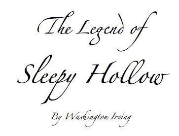
| We need a title page. For that we'll use the Zapfino typeface. In this image you can see that Apple's text services provides for irregular ligatures... |
|
| | | | | |
|
|
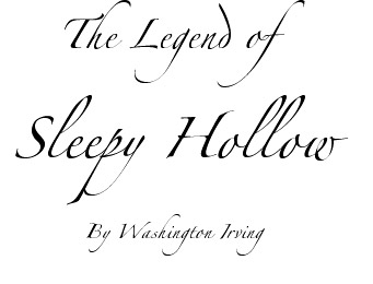
| And by contrast this is how the same text looks in a Carbon application like AppleWorks. |
|
| | | | | | |
|
|
I think that should cover most of the basics for getting started using Create for page layout. At some point I'll go into how to use Create for web design and illustration. I do talk about page layout in earlier versions of Create in Rhapsody (here and here) and a little about web design (here). I also try to help out by answering questions on Create and other Stone Design applications at the forums on the Stone Design web site .
Hope that helps anyone wanting to try Create! |
|
| | | | | | | | | |
 |