 | | | | | | | | | | | | | | | | | | | | | | | | | | | | |
|
| | | | | | |
|
| | | | | | | | | |
By Andrew Stone of Stone Design
January 1990 |
|
| | |
Abstract:
New interface techniques and usability testing guided the development of TextArt. NeXT software development has been an exciting and rewarding. The NeXTStep application kit greatly improves productivity, although dealing with a new OS has its challenges.
|
|
I.Introduction
Last spring when NeXT brought its Dog and Pony show to town, I convinced my colleague Kris Jensen to invite these NeXT guests to our user's group. Everyone was drooling, so the topic turned to “how do I get one now?” The fastest route, explained the helpful sales representatives, was to “Become a NeXT developer”. Having written software for the Macintosh and UNIX platforms, we found the NeXT to be a happy marriage between all we loved of both worlds: a grep and click dreamland. Stone Design [Andrew's company - EJL] submitted a proposal to create "Acme Gizmos", a package of add-on interface objects with even higher abstractions than offered by the NeXT development environment, the Appkit. We planned to provide objects such as Decks of cards, special interface objects like circular sliders and virtual spheres, and other objects which would aid non-programmers in creating useful applications. NeXT accepted us as developers, and last May, we were off to camp.
Developer Camp was definitely worth the $750. The only drawback was they made us quit hacking at 8pm each night. After four intense days, the 30 or so developers returned home, with manuals and cubes in hand, hierarchies and “views” in head.
After two weeks playing with the Appkit, I had found a better tool to work on: Here was this amazing machine with Display PostScript, and no way to brainlessly create interesting PostScript images. To make a long intro shorter, TextArt was born. Given NeXT's desire to position the cube as the desktop publishing workstation of choice, a package which allowed anyone to create powerful images instantly seemed like a winner. Six months later, after usability tests and much interface tweaking, version 1.0 was released. We will explore some of the custom controllers and special interface techniques developed for this product, and show how usability testing throughout the development cycle aided us in making design decisions.
II. The Mental Model
TextArt maps between the primitives of the PostScript language and graphical user interface objects. By clicking buttons and dragging sliders, the naive user has at his fingertips all the power of this language. Since the program was designed for people with no experience with PostScript, we attempted to provide the main options explicitly represented on the screen to let users “play”.
Our goals were
|
|
|
• to provide an environment which invites and rewards exploration. We believe that this adventure somehow unleashes creativity.
• to provide consistency throughout the interface. |
|
| |
|
|
| | |
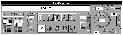
The main parameters panel provides access to the functions which apply to all modes and options: rotation, scaling, kerning and fonts; as well as the Image Window functions: zooming, gray levels and an inhibit display switch. The result of the execution of the generated postscript code is displayed in the Image Display window. |
|
| | | | | |
|
|
| | | | | |
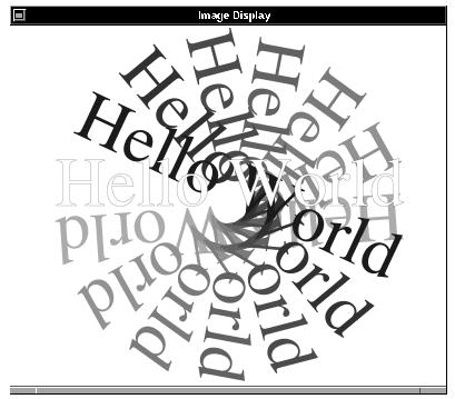
The Image Display Window |
|
The Image Display can be saved as an Encapsulated PostScript (.eps) file, transferred via the Pasteboard [the NeXT's shared buffer] to other NeXT programs or placed in a TextArt layout board for combination with other graphics. The layout board section is a complete draw package. A snapshot of an image can be very compactly represented as the state of each controller. Packed into a byte stream, files are less than 200 bytes.
Options and mode controls form the heart of the Main Parameters panel. Each option brings up a related window with more controllers specific to that function. Later we will explore the evolution of this panel.
III. New Controllers: Direct Manipulation by Proxy
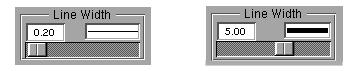
Although the NeXT with its 68030 CPU is quite fast, the elegant 4 gray level bitmaps and Display PostScript window server do take their toll. We derived a mental model we call “Direct Manipulation by Proxy”. Since the time to reimage a complex image can be several seconds, each controller has local feedback. We created special “Views” which echoed in real time the effect of the control. For example, the line view shows the line width: |
|
| | | | | | | |
|
|
| | | | | | | |
Line Views reflect the current line Width |
|
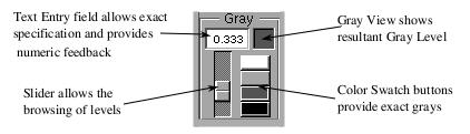
| Similarly, we developed a multi-purpose Gray Scale Controller. We wanted to incorporate these features: |
|
|
• Be able to specify the four exact gray levels instantly
• Be able to specify an arbitrary gray level exactly
• Be able to “walk the values” in order to select a level |
|
| The PostScript language represents gray levels as a real number from 1.0 white to 0.0 black. Our gray scale controller combines a text entry field for typed specification with numeric feedback when the slider is dragged and an exact color is specified via the color swatch buttons: |
|
| | | | | |
|
|
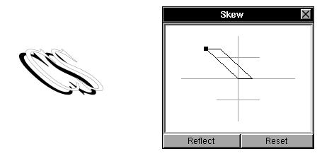
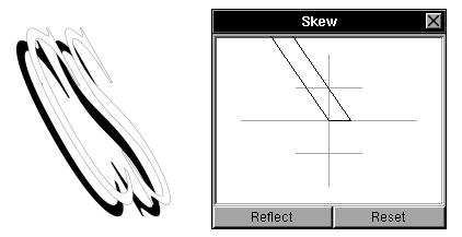
Two Dimensional Controllers:
Several options, such as multiple, skew and shadow, are best specified by coordinates. We used a custom controller that allowed mouse input to represent the x and y values. Users can predict the outcome of the operation. |
|
| | | | |
|
|
| One really useful side effect of entering a mouse down loop while tracking the mouse is that the window server stills sends mouse location events from beyond the perimeter of the current “key” window. This allows an arbitrarily large specification. |
|
| | | | | |
|
|
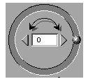
Rotational Sliders
A slider is a controller which allows a range of input values. In an effort to produce a mapping between the purpose of a slider to indicate the rotation of text and its visual appearance, we created a “Circular slider”. This device, pictured below, performs this mapping nicely. As an ergonomic feature, “crawling”, that is, moving by one degree at a time, is done by clicking on the right (positive) or left (negative) arrow. |
|
| | | | | | | | | | |
|
|
| | | | | | | | |
Rotational Sliders produce a mapping between Text Rotation and User Input |
|
IV. What We Learned From Usability Testing
Many of the elements of the interface underwent radical change because of problems recognized during usability testing. Throughout the course of development, a cross section of potential users were asked to test the program. Informal protocol studies were made. Perhaps the biggest problem with usability testing is that it shows that there exist problems, but not how to fix them. Only iterative testing can determine how successful a re- implemented interface is.
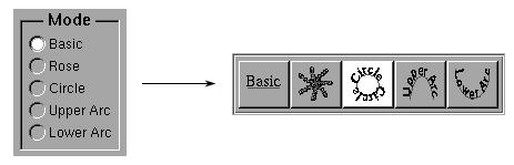
The interface moved towards “direct mappings” to help unclutter the general appearance by replacing text descriptions with icons. During the evolution of the interface, we realized that users do not share a common vocabulary in the description of effects. Previously the user had to learn the text description of an option, such as fill or outline. By representing the function with an icon showing the effect, the cognitive load placed on the user is reduced. The next figure shows the before and after of the modes. In TextArt, the mode refers to the manner in which the text is placed: in a line, a circle, etc. Since this is a mutually exclusive choice, radio buttons seemed like a natural way to represent the function. |
|
| | | |
|
|
The text representations didn't tell the user enough. We iconically combined the the text with the result of the choice using the layout of a set of old fashioned car radio buttons. Now the user can “see the text path” and select the correct one without first translating the text to an image and then deciding if that is the correct choice.
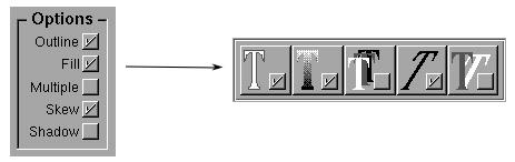
The option selection area likewise required translation of text into image, so was another candidate for representing pictorially. In order to show that the choices are combinatorial as opposed to mutually exclusive, we borrowed the checkbox metaphor already present in the NeXT interface. |
|
| | | | | | | |
|
|
| We integrated the checkbox switch with pictorial representations of the effects: |
|
| | | |
|
|
Users reacted very positively to this change, and it helped to satisfy our goal of consistency and explicitness.
Outline and Fill Options Dilemma
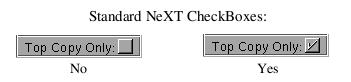
Another component of the interface which gave us trouble was the way to present the various options for fill and outline. In the PostScript language, you can “clip” to an arbitrary path, and then fill or outline this clipped region. Thus there is a fundamental algorithmic connection between fill and outline. This originally led us to present the user with these options on one panel.
First, note an earlier implementation of the Gray Controller using standard NeXT radio buttons instead of color swatch buttons. Secondly, note that we have barely met George Miller's “seven plus or minus two” rule, there are nine functions in the original panel. There has been talk that this rule should be restated “seven minus two”*, given recent studies! Usability tests showed that there was too much going on. Although there is an underlying programmatic reason for having the two options together, it is more consistent with the rest of the interface to have them separate: each check box on the main parameters panel brings up a separate options panel. The decision was made to break the panel into two, the only drawback being that the “Top Copy Only” switch needed to be replicated on the second panel to always insure access to this option which relates to the underlying clipping and not to either style in particular. Subsequent usability testing showed us that this division of 3 and 7 items was much more understandable to naive users. |
|
| |

|
|
There are several other issues in the redesign of these panels that warrant discussion: layout and organization, and iconification of ambiguous text. Following our desire for consistency we altered the layout so that all the color controls occupied the left half of the panel. This allows the user at a glance to establish the purpose of that portion of the panel, and leaves just a linear arrangement of less obvious controls. This separation of purpose is further emphasized by having all the gray control sliders move vertically and all the other options that use sliders use horizontal ones.
The final changes were the iconification of the two sets of radio buttons present in the original panel. The “Lines-Fill” pair caused users undo problems, after all, what does fill with fill mean?
The direction set of options represented a challenge to iconify. Note that two pieces of information are included in each switch: the direction of the fill and where the start is. This second piece of information provides the mapping for using the “Start Gray” and “End Gray” gray scale controllers.
For example, “Top to bottom” was translated into which contains both pieces of information.
V. Conclusion
Software is a process, not a product. Although managers do not want to hear this, it is true. Usability testing throughout product development will elucidate problem areas which can be iteratively refined. However, the success of the design decisions lie in whether real end users can effectively and enjoyably use the program. Thus the real world provides the next source of usability testing: a careful analysis of the problems which are discussed with the product support group will effectively show the weaknesses in the interface. Although this is no excuse for releasing Beta software, I contend that software is never perfect, and the most meaningful evaluation comes from the end user. |
|

